Unearthing the Past by Michael Kerbow

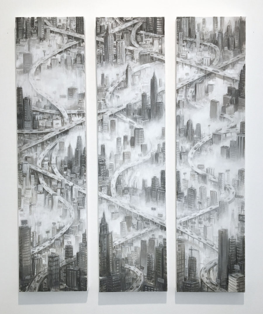
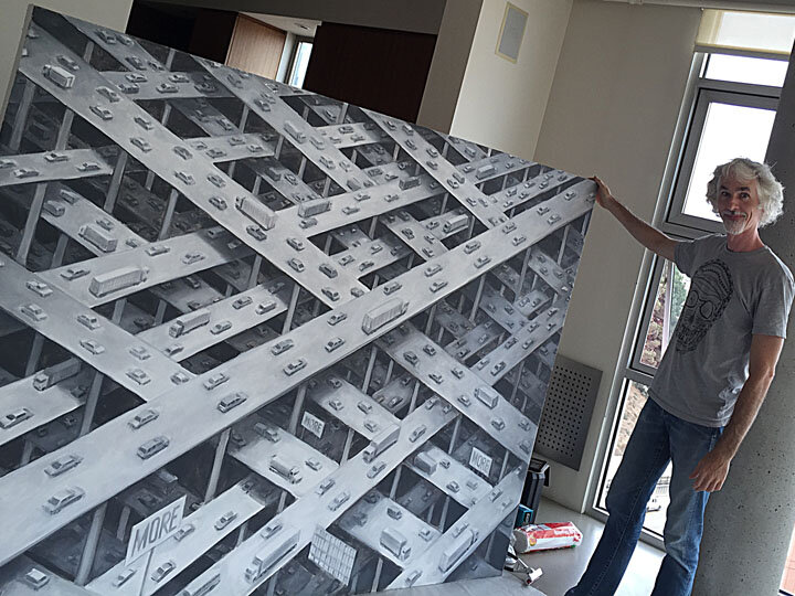
Creating a painting is like exploring a maze. You never know where the creative process will lead you. As a painting evolves, you encounter many twists and turns. And if you come upon a dead end (which is when a painting is simply not working), rather than despair and give up, you just retrace your steps and pursue a new direction. The interesting thing about staying flexible like this is you can sometimes find yourself creating a much better painting than you expected. Here’s a story about the creation of my painting “The Oil Age”.

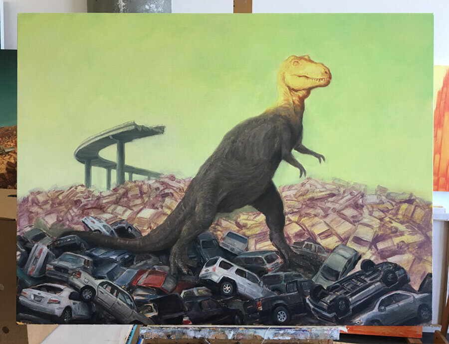
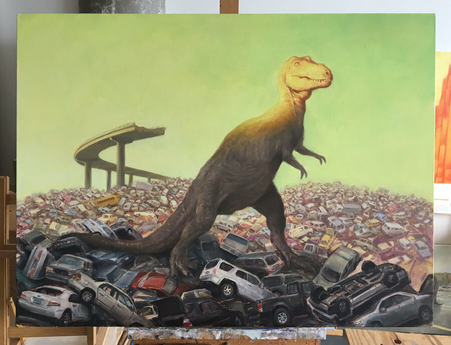
Inspired by an illustration of an Allosaurus by the classic paleoartist Charles R. Knight, I created a photoshopped mockup of a dinosaur eating a bunch of vintage muscle cars. Using this as a starting point, I began working on a large canvas, using my digital collage as a preparatory study. However I soon found myself struggling over my chosen composition, particularly in my attempts to resolve the elements in the surrounding landscape. Everything felt dull and lifeless. I had encountered one of those dead ends I speak of.

This is when I made the bold decision to paint over almost everything I had done so far. Only a few areas were left untouched. I hated having to take this drastic step, but it actually liberated me from my stalemate. Destroying my unsuccessful painting gave me a new foundation from which to begin again. I was able to chart a new path through the creative maze.

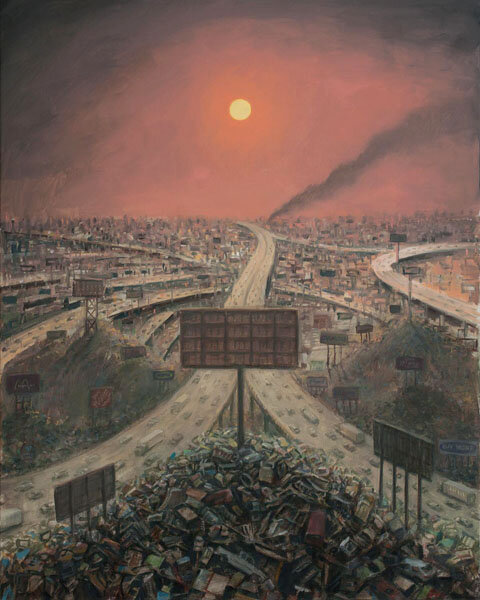
One of the things that had bothered me about my initial painting was the foreground and background felt incongruent. The lake I had painted in the middle distance effectively split the scene in half, also muddying the legibility of the dinosaur against this backdrop. So I decided to turn the scene into a mist-shrouded forest as a means to unify everything. The dinosaur and cars could appear within a clearing of this primordial forest, creating an effect similar to being upon a theatrical stage. And yet, I thought the painting needed still something more to bring it to a whole new level. I then had an epiphany. What if instead of just having trees, there were also dilapidated billboards and signage interspersed within the forest? Perhaps these signs could be gas station signs. This would give my painting a deeper ecological significance, as a critique of the oil industry and its environmental impact.

I drew a rough pencil sketch of my newfound idea. I envisioned my landscape filled with a cacophony of logos. I believed this riot of colorful signage would inject the vibrancy and drama I sought in my painting. I then searched online for visual reference material of oil company logos, and began painting them into my composition. This proved a bit more challenging than I had initially anticipated. It was difficult to weave a myriad of colors and shapes into my painting and still maintain a cohesive composition.

The painting was definitely looking better now, but I needed to knock down the intensity of the colors. So I added a few translucent glazes of color to unify things and give the forest a muggy, humid atmosphere. I also made adjustments to the dinosaur and cars. Another element I added was to have the signs display the price of gas as “505”. This may have been too obscure a clue for my audience, but I thought this number resembled the distress code of “SOS”, and this reinforced the ecological message within my painting. (Ironically, the price of gasoline has already exceeded this amount.)

I was thrilled with how my painting had improved, but there were still a few minor things that bugged me. For example, I felt the volcano in the distance was not visible enough. So I painted an opening through the tree line, and added a stream flowing through the forest. This gave me the room to enlarge my volcano significantly. It also allowed the T-Rex to stand out more prominently, which is exactly what I wanted.

At this point, the background looked finished to me. However I still wasn’t content with the shape of the dinosaur. It seemed too svelte. I wanted a more burly T-Rex. So I changed the dinosaur’s anatomy by enlarging the head, and gave it beefier legs. I also changed the lighting on its skin to better integrate within the scene.

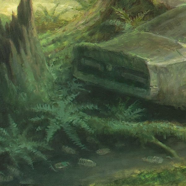
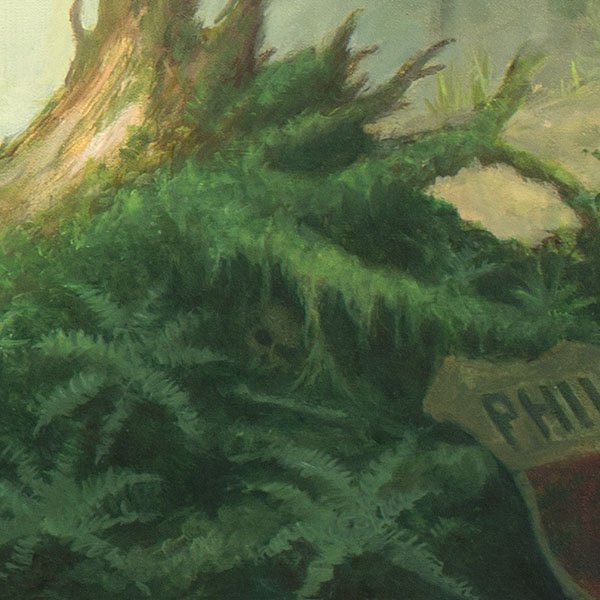
I then made a few final adjustments to the foreground, such as adding a Phillips 66 sign and rearranging some of some the ferns and roots. I also added some plastic bottles floating in the water near the bottom of the image, and a human skull tucked beneath an overturned tree stump. I sometimes like adding small details like this in my paintings as they can become little gifts to surprise the viewer.

And so, here is the final result.

I consider the painting to be an allegory about our society and its dangerous addiction to fossil fuels. The dinosaur is meant to represent the violent forces we have liberated from the ground. It could also be seen as a specter of extinction. As we rampantly consume things like coal, oil, and natural gas to drive our economy forward, these very substances are negatively harming our existence. The tremendous amount of CO2 and other greenhouse gases we have released into the atmosphere will have ramifications for all life for centuries to come. Our actions are producing mass extinctions. Perhaps we will fall victim to the same plight. I envision a time, far in the future, when the only evidence of our existence will be a geologic strata buried deep within the earth. This curious formation will be the remaining vestige of an era of human beings, known as the oil age.

Back to the Future by Michael Kerbow

Last year I began working on a new series of paintings that show the return of dinosaurs as they destroy and overrun our world. These works are allegories about many of the ecological and economic issues we face today. The resurrected dinosaurs represent the fossil fuels we have liberated from the ground, and their destructive violence mirrors the growing risks from climate change, environmental degradation, and mass extinctions. The underlying forces that have manifested these creatures are our ongoing addiction to oil, and the inherent dynamics of our capitalistic system. I call this painting series Late Capitalism.

These paintings originated from my nostalgia of childhood. My two primary obsessions as a young boy were cars and dinosaurs. These things were so cherished in my youth that it’s not surprising they inevitably found their way into my artwork as an adult. The dinosaurs I depict may not be up to date with current paleo-science, but they epitomize the book illustrations I remember seeing as a child, done by classic paleo-artists such as Charles R. Knight, Rudolph Zallinger, and Zdeněk Burian.

Charles Knight’s illustration of a Tyrannosaurus Rex

Charles Knight’s illustration of a Tyrannosaurus Rex

Charles R. Knight’s illustration of a T-Rex, shown above, inspired one of my recent paintings. I was enamored of how Knight had portrayed sunlight falling upon the dinosaur’s head. My painting would have a similarly posed T-Rex, standing heroically upon an immense pile of automobiles. In the distance would be the broken remains of a freeway. The cars and freeway would represent our fossil fuel based society, while the dinosaur would be the retribution we have manifested from greedily pursuing this paradigm.

Hot1.jpg

I blocked in my composition with a transparent wash of violet upon a yellow ground. Similar to Knight’s painting, I imagined the top of my T-Rex being dramatically lit, while everything else below would be in shadow. I left the sky area empty at this point, as I had not yet decided what would happen there.

Hot_cars.jpg

I typically work from imagination, so It can sometimes be challenging to paint certain objects convincingly without visual reference. In this circumstance, I used some toy cars to help me paint the pile of automobiles. I would simply hold one of these scale models in my left hand, as I painted with my right. This allowed me to study the reference model and gauge how the light would fall upon it.

Hot2.jpg

Midway though painting my pile of vehicles, I decided to make a change. I realized that if I created two distinct hillsides of cars, one sunlit and one in shadow, the scene would have a greater sense of depth. Of course, this meant I had to reduce many of the cars I had already sketched in, so they would appear further in the distance. It took several days to paint all of these smaller cars. I made sure to vary the colors and arrangement of the pile so it would look consistently random. I also added a schoolbus near the base of the freeway. Schoolbuses are a motif I’ve previously used to refer to future generations of society. They will be most impacted by climate change.

Hot_final.jpg

I call this painting Hothead. The title obviously alludes to the hostile T-Rex before us, but also to the implied threat of a hotter world, suggested here by the strangely tinted sky.

Late Capitalism has already proven to be a very fruitful body of work. I have developed over thirty new paintings in the past year alone, and I have ideas for new projects all the time. I look forward to seeing how this series develops. Hopefully some day I will have an opportunity to exhibit this body of work all together, I think the work would be all the more powerful if viewed as a group. Until then, I’ll be stay busy painting in my studio.

Hot_studio.jpg

Standing Tall by Michael Kerbow

Every year an art gallery near where I live invites twenty-four regional artists to submit two paintings for a show called 48 Pillars. Every painting must be done using a 48x12 inch vertical canvas, hence the title of the show. I was asked to participate in the show for 2020, which I immediately accepted.

I found the size constraint of this exhibition to be an intriguing challenge. What kind of painting could I create that would work successfully as a tall, narrow shape? Since I tend to paint landscapes, I immediately thought of painting something that emulated traditional Chinese landscape art, such as the example below. (credit: unknown)

Inter_trad.jpg

Although I only needed to create two works of art for this show, I decided to create three paintings, in case one of them failed to turn out OK. I aligned the three vertical canvases side by side on my easel and began sketching out my idea. In lieu of mountains and trees shrouded in mist, as seen in traditional Chinese landscape art, I introduced city skyscrapers and winding freeways emerging from what could possibly be smog. And since Chinese painting traditionally done with black ink, I chose to maintain a grey color palette, specifically using only white and black paint.

Inter_progress.jpg

I didn’t want to become mired down painting a lot of intricate details, so I tried to keep my brush strokes loose and painterly. My choice to maintain a monochromatic palette proved somewhat challenging. I discovered that, depending on whether I painted light over dark, or dark over light, my grey values would shift, resulting in either a warm grey or cool grey cast. I had to sometimes mix in small amounts of brown and blue paint to rebalance the neutrality of my greys.

Interzone_detail.jpg

I decided to call my finished painting Interzone. This title partly derives from a song of the same name by the band Joy Division that I felt matched the frenetic, bleak emptiness of my image, as well as a landscape that is simultaneously fragmented and interconnected.

Interzone_final.jpg

Searching for More by Michael Kerbow

One of the things that troubles me about our society is our predilection for rampant consumption. We feverishly transform the natural world around us in our quest to manufacture all the things we desire. However these actions have become so excessive that we appear to be disrupting the ecological balance of the planet. We never seem satiated, always consuming more and more. I fear it will be the end of us.

A few years ago I created a painting inspired by the German Romantic artist Casper David Friedrich and his work Wanderer Above the Mist c. 1818. I replaced Friedrich’s lone figure gazing upon sublime nature with a series of billboards sprouting from a dystopic landscape of endlessly sprawling freeways and piles of garbage. I called my painting The Land of Plenty. It was intended as a critique of our habit of hyper-consumerism and how it impacts our world.

Upon completing my painting, I recognized the composition would have greater impact if it were transformed into a panorama. So I made a preparatory drawing of my idea in graphite. The image would be similar as before, but showing a much wider, expansive landscape. Contrails would crisscross the sky, mirroring the looping freeways below.. I initially considered including a figure in my composition, similar to Friedrich’s painting, but I later opted not to, so the person viewing my work could become that solitary witness.

Prom_study.jpg

I wanted my painting to be massive. But as large canvases are difficult to transport, I decided to construct three separate panels instead of a single canvas. And since this would be too wide to fit on my easel, I placed the canvases on milk crates stacked along my studio wall.

I started my underpainting by giving the canvas a wash of transparent yellow for a golden glow. I then gradually began adding details to build up a complex scene with freeways, billboards, and of course, lots and lots of cars. My goal was to create a landscape that looked simultaneously beautiful and disturbing. To help with this aim, I chose a warm color palette that seemed alluring, and yet somewhat sickly.

Prom_painting.jpg
Prom_detail.jpg

If you look closely, you will notice that all the billboards say the word MORE. It is like an incessant exhortation to consume. Of course, the irony here is these billboards rise from vast mountains of discarded objects, cast off by a populace who has grown weary of these things. I call this painting The Promised Land. What you find in this bleak landscape of excess and waste is a sprawling metastasis upon the natural landscape. All of the billboards may promise fulfillment, but they actually signal a path to annihilation. What you discover is a landscape which represents the terminus of a society which has consumed everything in sight.

Promised Land.JPG

Flawed Logic by Michael Kerbow

flat_earth.jpg

It’s commonly said that people used to believe the earth was flat. They thought the world was a flat disk surrounded by water, and if you ventured too far out to sea, you would sail over the edge. They couldn’t accept that we live on a sphere, as surely anyone living on the bottom would fall off.

Nowadays some people refute the science of humans causing climate change. In spite of overwhelming evidence, they insist climate change is not real or is a hoax. They fail to realize we are heading towards a perilous, uncertain future. Our persistent use of fossil fuels over the past century has flooded the atmosphere with greenhouse gases which are now clearly warming the planet. The longer this continues, the more precarious things will become. Scientists have predicted that, if we don’t drastically curtail our consumption of fossil fuels, we may initiate a cascade of unstoppable changes to the planet. We are in a situation not unlike those fabled ships heading towards the edge of the world. Unless we can turn this ship around, we are going to find ourselves crossing a point of no return.

I wanted to encapsulate my concerns of climate change in a painting. The image of ship heading over the edge of the world seemed an apt metaphor for our current predicament. Instead of a sailing ship, however, I would have an oil tanker to symbolize our society’s addiction to fossil fuels.

Tanker.jpg

I did a few preliminary studies of my idea. I tried both horizontal and vertical compositions. Eventually I chose a tall, narrow shape to convey a sense of perilous depth. The ship would be shown on the precipice of a plunging waterfall, about to slip over and plummet towards the abyss below.

Uncharted_study.jpg

After completing my preparatory work, I began working on a full-sized canvas. I started my under-painting with yellows and greens, hoping this foundation would give my painting an eerie, aquamarine glow. The image developed quickly, as I steadily refined the sky, waterfall, and ship.

Eventually the only thing left to do was add a name on the bow of the ship. I rarely have text in my art as it tends to dominate an image, but in this circumstance, I felt it would be a helpful to have something to paraphrase my painting’s concept.

Uncharted_tanker.jpg

I mulled over a number of possible names. I considered words like arrogance and hubris as they suggest our stubborn reliance on oil. When I looked up the word hubris in the dictionary, I encountered a word I was unfamiliar with ~ hamartia. This word derives from ancient Greek, and is most often used when describing dramatic literature. Hamartia refers to the fatal flaw that leads to the downfall of a tragic hero or heroine. I recognized immediately that I had found the ideal name for my ship. Not only did hamartia allude to my concept, but it actually sounded like the name of a ship.

Uncharted_Hamartia.jpg

Now that my painting was finished, I still needed a title. I tend to leave this task until the end, as it keeps the painting from being confined by a name during the creative process. I like my titles to guide my audience without over-clarifying my concept. A title should complement or augment a painting, never supersede it. It requires the right balance. If a title is too obvious or didactic, or conversely too opaque, the integrity of the artwork may be compramized.

The title I chose for this painting is Uncharted Waters. It signifies the unfamiliar territory we are now entering. Our actions have already begun to transform the environment. And as the planet grows warmer, sea levels rise, and storms become more severe, we shall soon find ourselves living upon a radically changed planet. I don’t know what lies ahead, but as my painting presages, our future could be quite treacherous.

Uncharted_Waters.jpg

The Road Ahead by Michael Kerbow

I used to feel self-conscious that I was an artist. Compared to other careers like teaching or medicine, art-making seemed like a self-indulgent profession as it revolves around me and my interests. I thought, “Why should anyone care about my artwork? What’s the benefit for them?”

The truth is, making art does have merit. Art has the ability to convey thoughts and emotions that are beyond the scope of language. It lets us experience new things, and helps to expand our awareness of the world. Art can also bring us closer together, and reminds us what it is to be alive. So it turns out, it would only be selfish of me if I never shared my art with the world.

I believe a fundamental role of an artist is to create artwork that captures the current zeitgeist, so others may better understand what is happening in the world. An artist transmutes their insights through their art to reveal the world today, and where things may be tomorrow. In effect, the artist shines a light into the darkness, to reveal a glimpse of the future.

When I look around today, I see a number of things that concern me. Our society has an insatiable appetite to consume everything in sight. I view climate change to be the most important issue we face today, and yet frustratingly, we are not responding swiftly enough to this existential threat. Instead we seem addicted to an unsustainable paradigm that is leading us towards a dark, uncertain future.

I had an idea for a metaphorical way to depict this grim trajectory I see us currently on. I envisioned a vast metropolis of towering skyscrapers, interlaced with roads and tunnels. The immense scale of this city would dwarf its inhabitants. The focal point would be a vast traffic-laden boulevard, flowing though a deep, urban canyon. Everything would recede towards a single vanishing point, far in the distance. This would represent the future that awaits us.

I made a few preparatory studies for my composition. I imagined my canvas would need to be quite large, as I wanted the viewer to feel engulfed by the skyscrapers looming overhead and the swath of traffic flowing below. I hoped it would produce a feeling of vertigo. And to accentuate the dreariness of the scene, I chose an anemic, taupe color for my palette. I used a black grease pencil to render my city on the canvas. This allowed me to smudge my drawing with solvent for an atmospheric sfumato, so the city would feel engulfed in smog.

Course3.jpg

At this point I hesitated. I had initially thought to create a very detailed image. But I liked my painting the way it currently looked. The city looked ghostly and mysterious. I wondered if I needed to do anything further. So I put my painting aside, and started an ink drawing to help me determine what to do next. The drawing became increasingly complex as I kept adding details, until eventually, it grew tiresome. I found rendering every window on every building, and every car and truck, extremely taxing. I had to force myself to finish the drawing, but in the end it was worthwhile. The drawing helped me understand that too much visual information made the image stifling. I didn’t need lots of details to convey a sense of awe.

Course4.jpg

I returned to my painting and solidified the buildings and traffic a bit further, but strove to maintain a looseness. I didn’t want my painting to become overly illustrative. I added a few small details however, such as flagpoles and water towers on the buildings, and a few small people here and there. I also added billboards displaying the word MORE. I hoped this bit of dark humor would alleviate the bleakness of my painting and make it more approachable. It’s a motif I’ve used before in several paintings, as a metaphor for consumption. Seen collectively, these signs become a ceaseless mantra of an insatiable society.

Course5.jpg

We are so engrossed in our daily lives, focused upon our respective struggles, that we may not realize how our civilization marches inexorably along a path, towards an uncertain future. We are like a bunch of ants working within a colony. We try to fulfill our role within society, but are powerless to control the agenda of the whole. The hive mind of the collective has its own trajectory, but it may not be for our betterment. The question we should be asking ourselves is, where is this colony taking us?

The painting is titled Course of Empire.

Course of Empire.JPG

Disappearing Act by Michael Kerbow

The process of creating art requires sincere focus from the artist. It’s a constant dance of adding and subtracting. The painter, for example, must be attentive to what a painting needs, or what to take out. Of course, poor choices can ruin a painting, just as spending too much effort overworking an image can extinguish its vitality. The artist mustn’t be inhibited by these risks, however. It simply requires a willingness to fail. By remaining in tune with the creative process, art can blossom into what it is meant to become.

I recently had an idea to paint a massive glacier as it met the sea. Frozen within this wall of ice would be things like cargo ships, jet planes, and trucks. These man-made objects would symbolize the fundamental role of humans in contributing to climate change. And they would be emerging from the thawing ice, like a villain stepping onto a stage.

Intro2.jpg

I made some preliminary studies to figure out my composition. This made me realize that, if I wanted to convey the immense size of a glacier, I would need to make the various ships and planes appear quite small, or my painting would need to be extremely large. I questioned whether I could successfully pull off my idea.

IntroColor.jpg

I also made a few small color studies to evaluate different color options for my painting. I envisioned the glacier as a swooping arc of ice that loomed over and engulfed the viewer. I believed this would make a striking composition.

Intro3.jpg

I initially imagined my scene as dark and moody. I envisioned it as having a strange light emanating from within the glacier, revealing shadowy forms of ships and planes trapped in the ice. However the golden yellow color of my under-painting caused me to rethink this direction. I liked how the warm yellow complemented the teal blue of my glacier. It dawned on me that, if I made the sky feel warm and tropical, I could allude to a radically changing climate without the need to include any vehicles in the ice.

Intro4.jpg

My first attempt at a salmon pink sky didn’t feel right. The colors seemed too muted for the level of drama I wanted, so I changed the sky into an intense vermilion sunset. I also changed the glacier’s profile as it seemed too uniformly even. A more ragged edge looked better.

Intro5.jpg

I loved how vibrant the painting had become. The colors looked almost electric. Yet the painting still needed something. I finally decided the glacier was too evenly lit. Therefore I added some additional highlights and shadows to vary the tonal values and translucence of the ice.

I call the painting Introductions. The title could allude to the icebergs calving into the water, or the uncharacteristic sky above. Both of these hint at a warming planet.

IntroFinal.jpg

As with a lot of my paintings, this one evolved significantly over the course of its creation. I abandoned ideas and course-corrected a number of times. I learned long ago that staying responsive to a painting can lead to interesting results. Ideally they produce a stronger piece of art. If the artist can remain flexible, their art will always surprise and delight them.

The Shape of Things by Michael Kerbow

Every artist has certain preferences when creating art. For example, I like piling things into mounds. I’ve never quite understood why, but I’ve come to accept it as part of my artistic vision. A few years ago I made a couple of studies showing a massive pile of cars. I loved Matchbox cars as a kid. I think in some way, the paintings were my way of reveling in my childhood. My five-year-old self would have considered an enormous pile of Matchbox cars to be the ultimate treasure trove.

matchboxcars.jpg

These images intrigued me. They looked comical, but seemed rather pointless. On a lark I turned one of the paintings upside down and was surprised to discover the image felt more alive. What had previously been a towering pile of cars now resembled an giant, hanging mass of bees. I decided to call the painting Hive.

HiveFinal.jpg

Hive marked the beginning of a new direction in my art. For years I had been seeking ways to explore important issues like climate change and environmental degradation through my art. The automobile seemed an apt symbol for examining these issues, as cars are so indicative of modern society and our dependence on fossil fuels.

The idea to paint a towering pile of cars remained in my head. It was a compulsive image. This time I thought I would show a pile of cars as an island, or a reef surrounded by water. My concept was that someday, after the icecaps had melted due to climate change, there would remain a solitary pile of cars jutting out of the ocean. The dark irony here would be that these cars had been responsible for creating the situation in the first place. Not only were they the catalyst for this transformation, they were now the victims of it. My painting would be an allegory about cause and effect, or what goes around, comes around.

My initial attempt at rendering the image as a side view, showing above and below the waterline, was problematic. It wasn’t readily apparent this was a submerged pile of cars. So I adjusted the vantage point slightly to reveal more of the water surface. I decreased the height of the pile, so only a small portion protruded above the waterline. I also added some clouds to the sky, to add depth and scale to the image.

I as surprised when a collector quickly bought my painting, immediately after I had finished it. I had only intended it to be an exploratory sketch. This prompted me to paint a new version for an upcoming show. It would be larger so I could have more details.

CastawaysDetail.jpg

Below is the painting I made. I call it Castaways. It feels humorous, and yet somehow poignant. I like that it is enigmatic and allows plenty of room for interpretation. It’s interesting how much this painting resembles the early stage of Hive. Obviously I had an image in my head that needed to be expressed.

Castaways.JPG

Looking Backward, Moving Forward by Michael Kerbow

As I write this, 2015 has just ended, and 2016 has begun. I suppose the passing of one year into the next is like the cycle of life. Something dies, to be replaced by something new. This happens in my studio as well. If a painting I’ve been working on doesn’t pan out, I won’t throw it away. Instead, I paint over it, to create something new.

Around seven years ago I made a series of paintings inspired by the work of two 19th century artists, John Martin and Francis Danby. These Romantic-era painters were known for their dramatic scenes, often of turbulent events like massive floods and violent earthquakes. They seemed to have an affinity for biblical stories about the wrath of God. I suppose these paintings functioned like the disaster movies Hollywood creates today. As a matter of fact, Martin and Danby’s paintings have influenced the artistic vision of many filmmakers and writers over the years.

The Deluge by Francis Danby, 1839

The Deluge by Francis Danby, 1839

The Great Day of His Wrath by John Martin, 1853

The Great Day of His Wrath by John Martin, 1853

The Deluge by John Martin, 1834

The Deluge by John Martin, 1834

I reimagined the three paintings above by showing the destruction of modern cities and skyscrapers. I had painted them during the 2008-2009 financial crisis. The world’s economy was in free-fall, and our society was facing a global disaster. I was expressing the bleakness and anxiety a lot of of people were feeling at that time.

The Drowning, 2009

The Drowning, 2009

Cumulative Events, 2009

Cumulative Events, 2009

The Merging, 2009

The Merging, 2009

Unfortunately, after completing my paintings, I became disenchanted with what I had done. They seemed too derivative and not distinctive enough to hold their own. I believed I hadn’t created anything that wasn’t better conveyed in Martin and Danby’s artwork. So I chose to paint over my three paintings and start a new series. However, I didn’t paint over them entirely. I allowed certain areas to show through. I believe in the end, this produced a more dynamic series of paintings than if I had simply started with blank canvas. The compositional structure of the initial paintings imbues a richness to the final result.

If you look closely at the images below, you may discern where the original paintings are still visible. I find it interesting that the mood of the first version carries through to the second, in spite of the different subject matter. To me they both contain a sense of menace and darkness.

Fading Empire, 2010 (previously The Drowning)

Fading Empire, 2010 (previously The Drowning)

Descent, 2010 (previously Cumulative Events)

Descent, 2010 (previously Cumulative Events)

Junction, 2010 (previously The Merging)

Junction, 2010 (previously The Merging)

I wonder what a future art historian might think if they discovered the images buried within these paintings. These hidden images will be like ghosts whispering their secrets from another time.

When Things Are Grey by Michael Kerbow

It’s intriguing how certain experiences can result in the creation of a new work of art. Earlier this year I was going through a period of extreme frustration related to a failed relationship. One evening I was at my studio listening to Nine Inch Nails and having a glass of whisky. I decided to make a drawing to process the emotions I was feeling. An idea quickly emerged as I began making random marks on the paper.

GridlockSketch.jpg

This is the drawing that resulted. It does a good job of capturing how I felt at the time. I was feeling trapped and unable to access a different path from the one I found myself on. My agitated state of mind, combined with the music and whisky, resulted in a rather interesting drawing. I thought perhaps it might look good as a monochromatic painting.

torritpaint.jpg

Once a year the paint manufacturer, Gamblin Artists Colors, cleans their air filtration system and makes a special grey oil paint from the captured mixture of pigments. Gamblin calls this color Torrit Grey. They then give it to customers who buy their oil paint. I happened to have a few tubes in my studio.

underdrawing.jpg

I started by preparing a large piece of canvas. Normally I paint on stretched canvas, but in this circumstance, due to the size I simply tacked it to the wall. I spent several days refining my preliminary drawing. I made sure to leave an empty border around the perimeter so I could later stretch my canvas onto a frame when finished. I then began using my Torrit Grey paint, allowing the graphite in my drawing to mix with the pigment.

gridlockprog.jpg

Initially, the painting progressed very quickly. I was surprised that I was able to complete the lower half in about a day. However, the rest of the painting took much longer. I suspect this was because my composition grew increasingly complex as it extended into the distance.

gridlockfinal.jpg

The painting proved to be quite popular with visitors to my studio. It sold almost immediately to a European art collector soon after completion. I spent the following week constructing a large stretcher frame for my finished painting. The canvas was then rolled up, and delivered to its new owner, where it was assembled on site.

I call my painting Gridlock. It now hangs on the wall of its new home. I’m pleased with how nice it looks in the space. I think it fills the wall perfectly.

gridlockwall.jpg